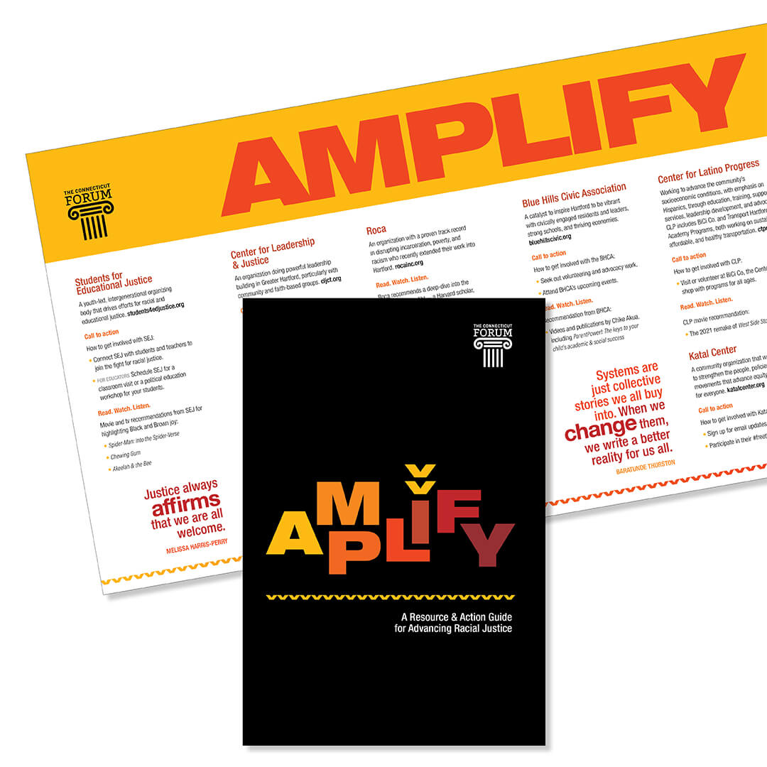
Project: Amplify Event Branding
Client: CT Forum
Role: Strategic Advisor, Art Director, Illustrator, and Designer to internal Marketing Team
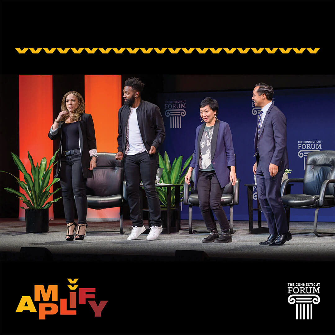
“A poet, a mayor, and a writer start a double-dutch team…” This was a light-hearted moment during an incredible discussion at “The Fight for Racial Justice: Understanding and Dismantling Systemic Racism” event held in February 2022.
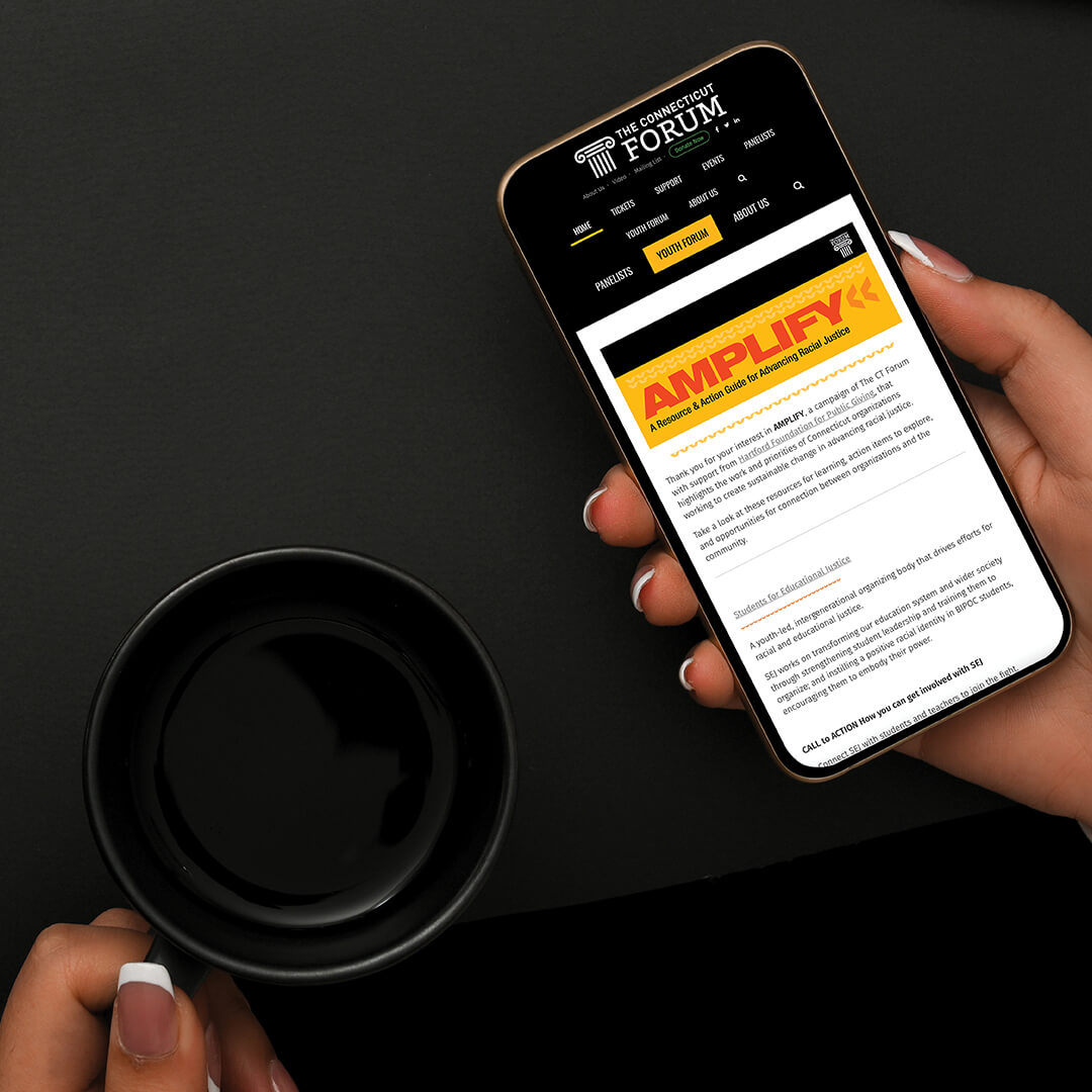
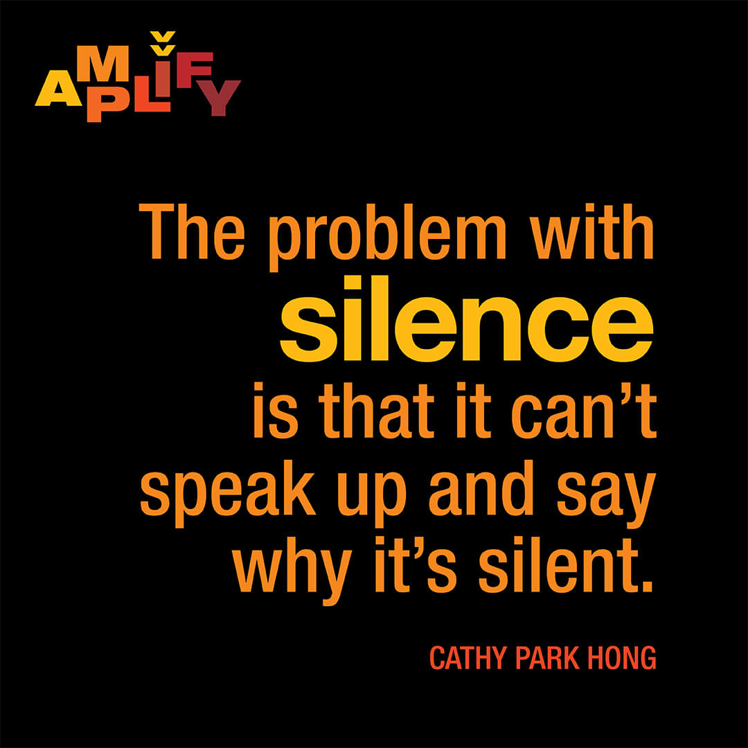
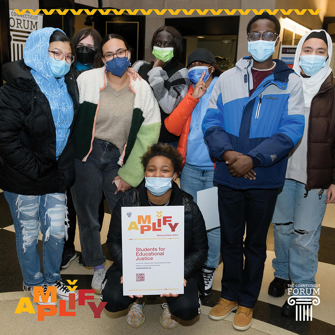
In an unscripted conversation, the diverse and accomplished panel of Cathy Park Hong, Baratunde Thurston, and Julian Castro (moderated by Melissa Harris-Perry) examined and confronted the structural inequities embedded in our systems and institutions. Associated with the Racial Justice Forum, and with support from The Hartford Foundation, the AMPLIFY campaign highlighted the work and priorities of Connecticut organizations working to create sustainable change in advancing racial justice. The AMPLIFY campaign links directed participants to resources for learning, action items to explore, and opportunities for connection. After all, double-dutch is all about connection and collaboration…
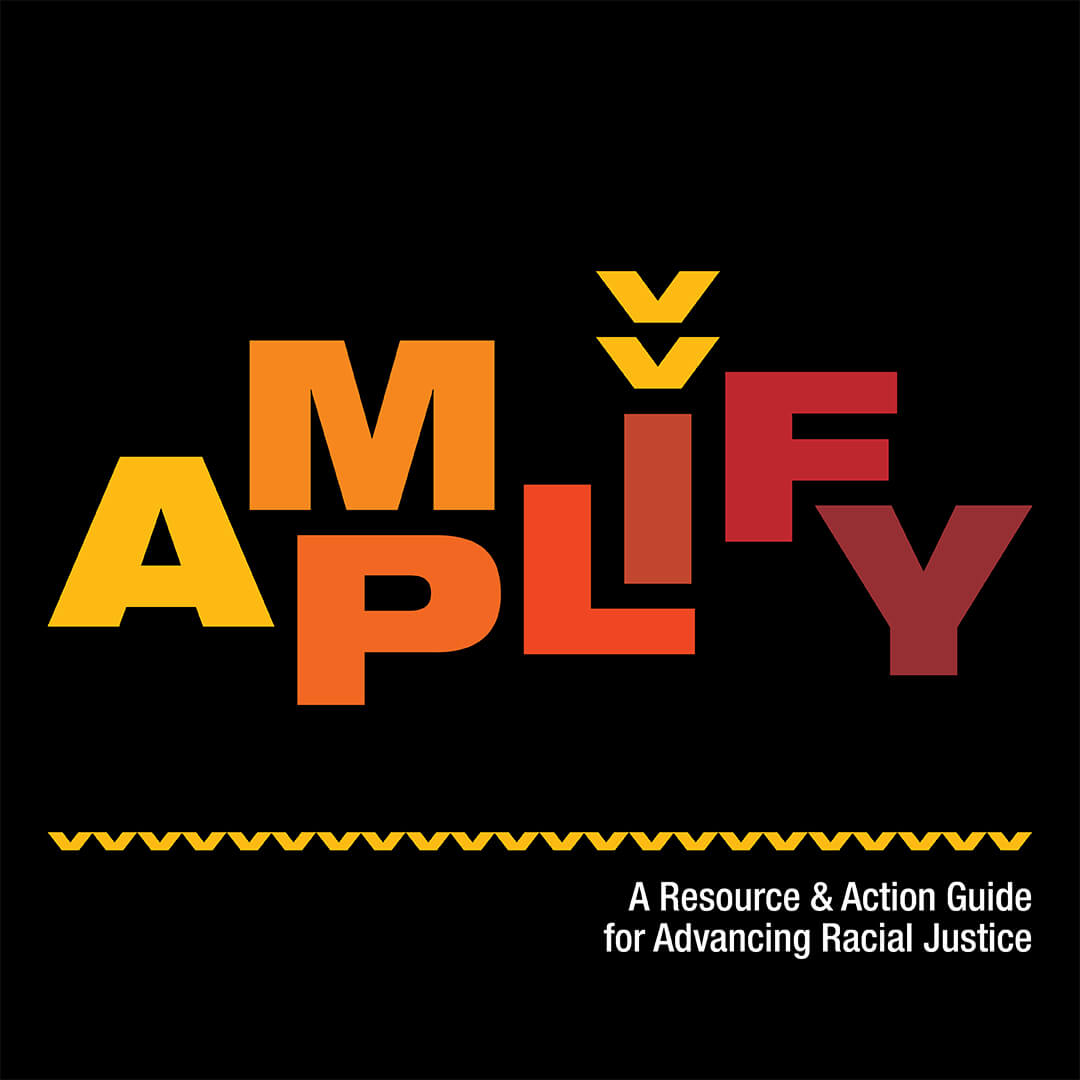
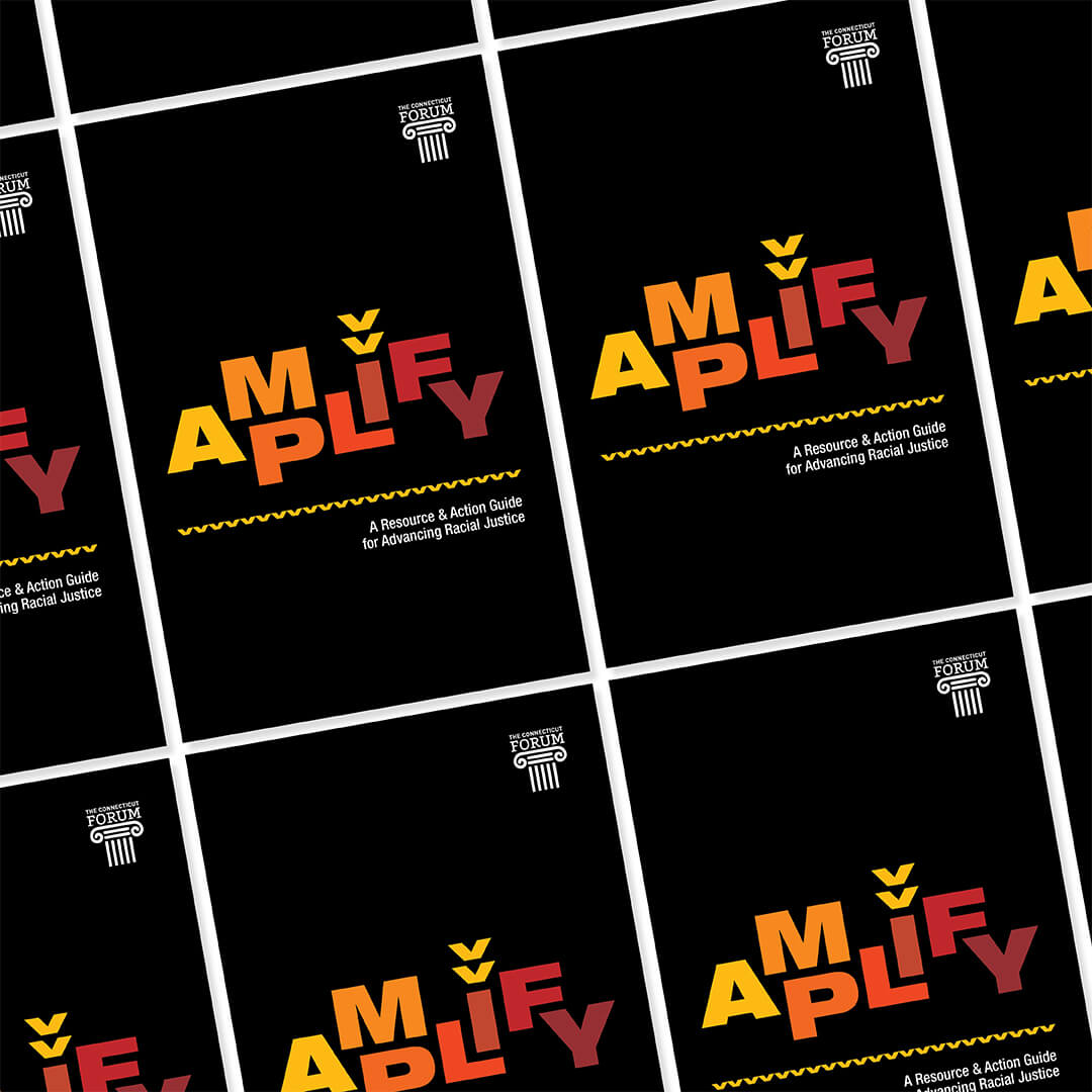
It was in this spirit that Firebrick Design collaborated with CT Forum to create the look and feel of the AMPLIFY campaign, which included the program branding, assets for marketing, printed and online literature, and event showcase design. All aspects of the campaign were developed strategically to achieve the goals of wide access to the information, the creation of conversations, and the empowering of individuals to start actions to advance racial justice.
A thoughtful use of online and email resources, as well as the leveraging of the immediate power of QR codes, were economical choices for this non-profit organization — these options augmented the print materials and eliminated some of the friction involved with access and decimation of information across populations.
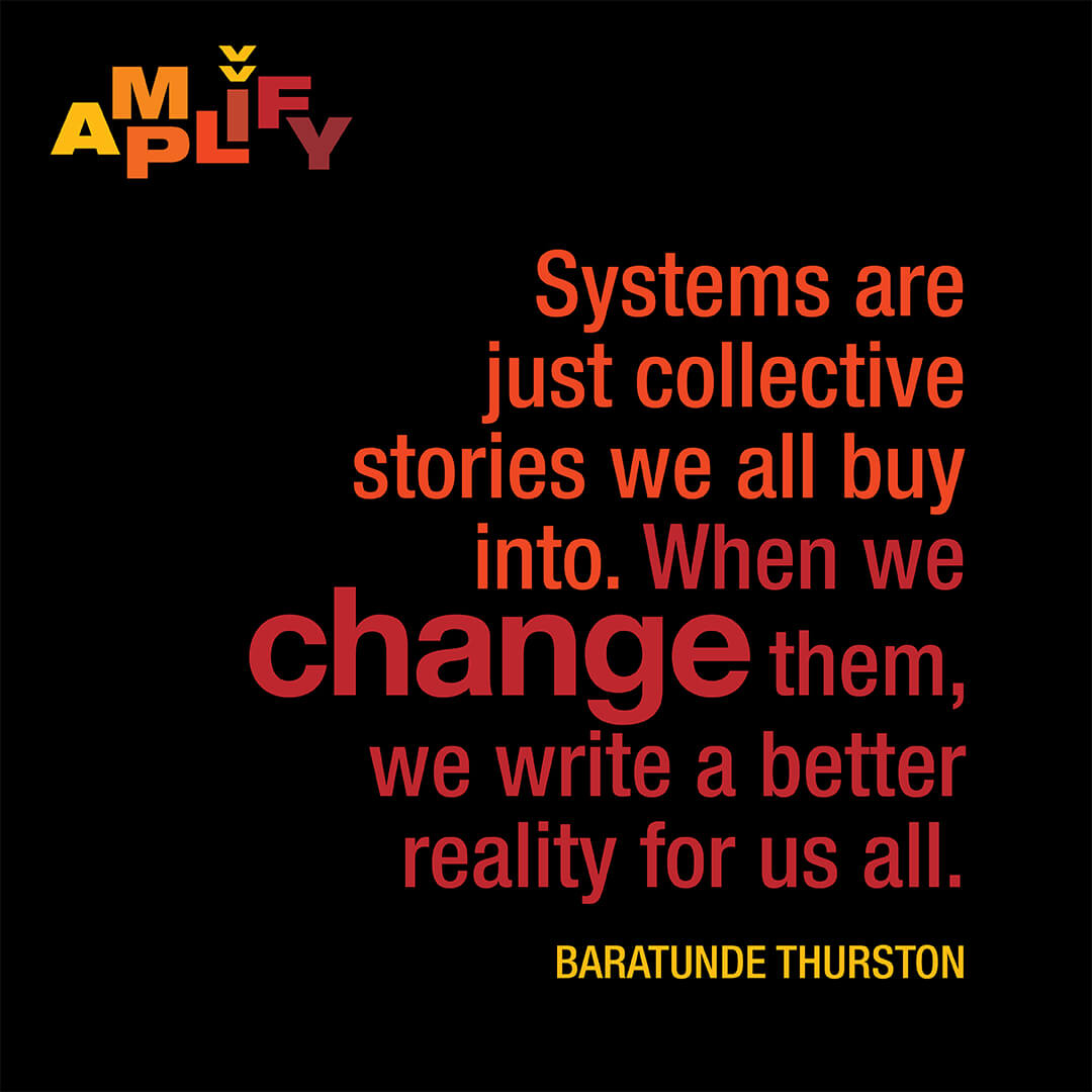
The concept of the amplification and spread of information was implicit in the brand development; the stylized megaphone mark created over the “I” in the “AMPLIFY” logo and the subsequent repositioning of the mark to create sound waves reiterates the theme throughout the brand application. The movement of the letterforms in the logomark implies action, while also lending some playfulness to the program — after all, while the achievement of racial justice is a serious topic, the people involved should experience joy in the process. The deep color palette ensures that the overall tone is of consequence.
- Art Direction
- Branding
- Illustration
- Invitation Design
- Social media

